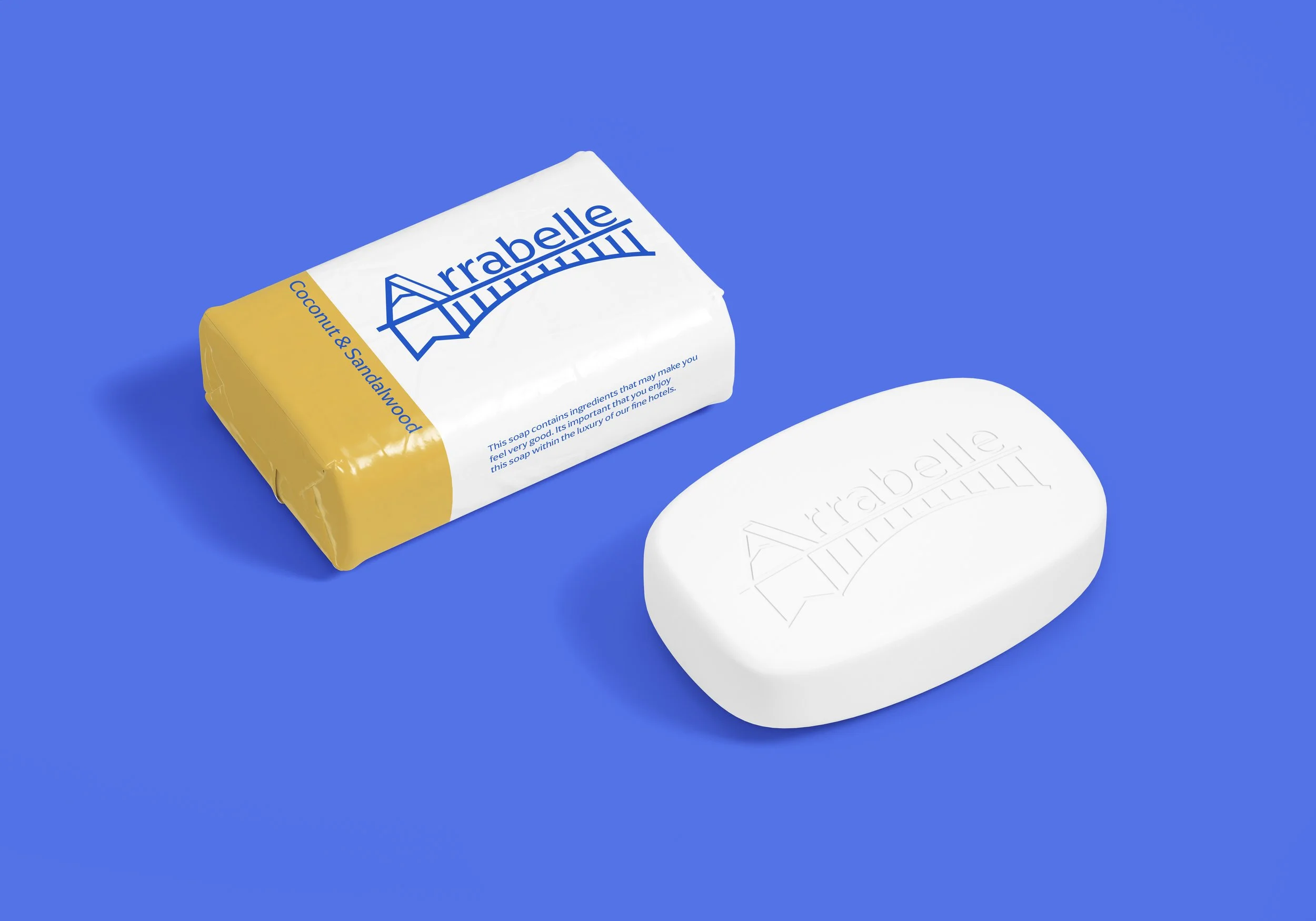
Arrabelle rebrand
The apogee
In search of a brand to redesign I discovered the Arrabelle, a luxury ski resort in Vail, Colorado. Upon examining the resort's branding, I found that it had room to represent their company with more robust branding. To create an effective design, I researched the target audience for luxury brands and found that the Arrabelle's likely target consumer is the group of HENRYs (high earners, not rich yet), who are typically younger in age. I also evaluated the competition in the area, with Mountain Haus being a nearby competitor. To set the Arrabelle apart, I highlighted its unique advantages, including its proximity to the ski lift, its European vibe, and village-like atmosphere. Ultimately, my goal is to create a comprehensive redesign that will help elevate the Arrabelle's branding and set it apart from its competitors.
Objective: Rebranding the Arrabelle hotel in Vail, Colorado.
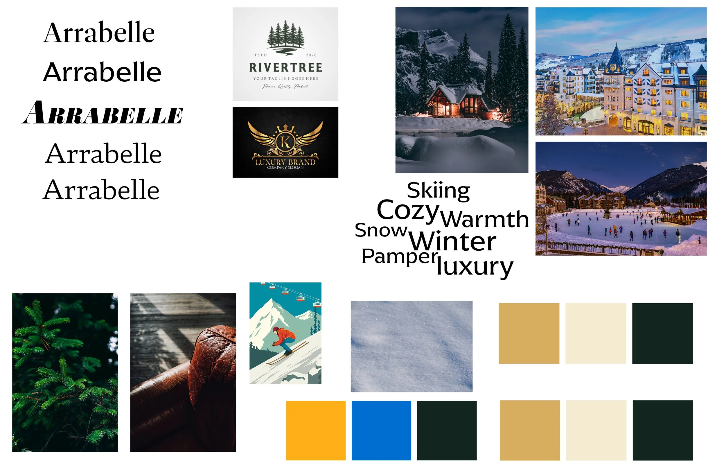
I created mood boards featuring various images and color schemes that I felt represented the essence of a luxury ski resort. The pictures included images of the resort's exterior, cozy log cabins, and other ski resorts. Based on these images, I developed color schemes that reflected the luxurious atmosphere of the resort. The mood boards helped me realize the stark contrast between the cold winter environment and the warm and inviting cottages. Ultimately, I created two mood boards, one featuring pictures and the other showcasing the color schemes.
Thumbnailing
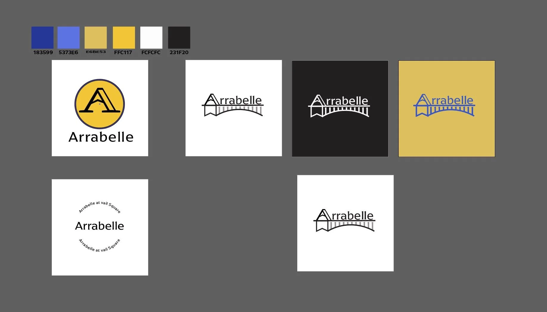
During the logo design process, I began brainstorming different ideas that would tie into the themes of luxury, skiing, mountains, and spa. From there, I started jotting down loose ideas that I could potentially implement into the logo design. I wanted to focus primarily on luxury and mountains without including too many other elements. As I was brainstorming, I noticed that the physical building of the Arrabelle had a pointed clock tower and a bridge that were significant to the brand and the physical location in Vail. I believed that these elements could be incorporated into the logo design. I started thumbnailing different concepts, and three ideas stood out to me. The first was an "A" lettermark logo, which I developed slightly based on the company's original logo. I added a mountain inside the inner part of the "A" using a figure-ground relationship to establish it. The second idea was an emblem style logo that included a circular stamp-looking design, but it did not work out as I had hoped. Finally, I developed a concept that incorporated the tower and bridge elements, with the bridge serving as an underline for the rest of the word "Arrabelle." I used a similar A to the lettermark logo, with the mountain inside and the double stem, and placed it above the bridge. Overall, my research and thumbnailing process helped me to notice the significant elements of the building and incorporate them into the logo design.
