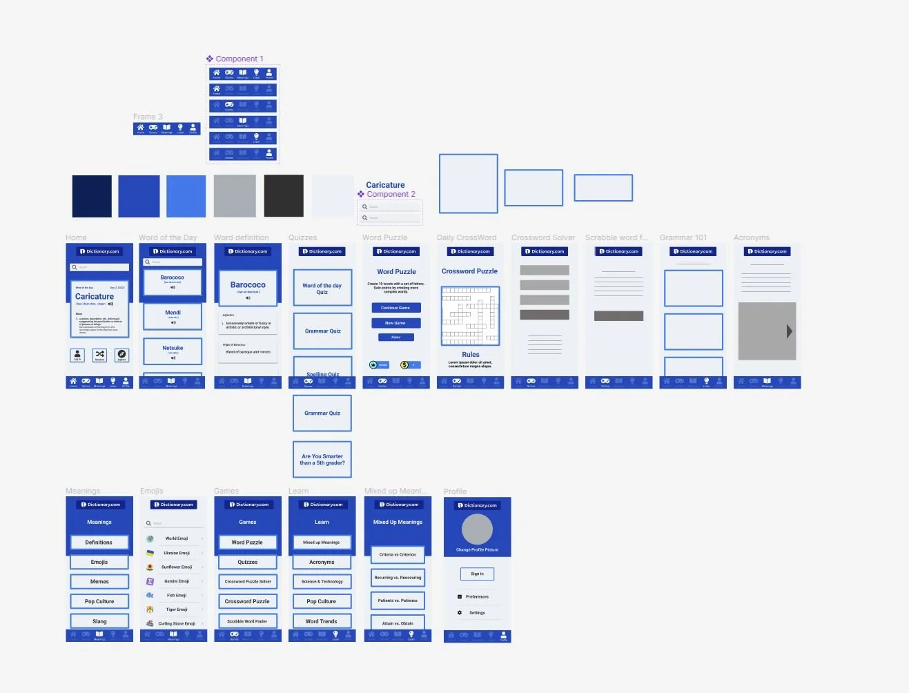
ui/ux redesign - Bottom navigation bar redesign
First the project started off with a problem statement:
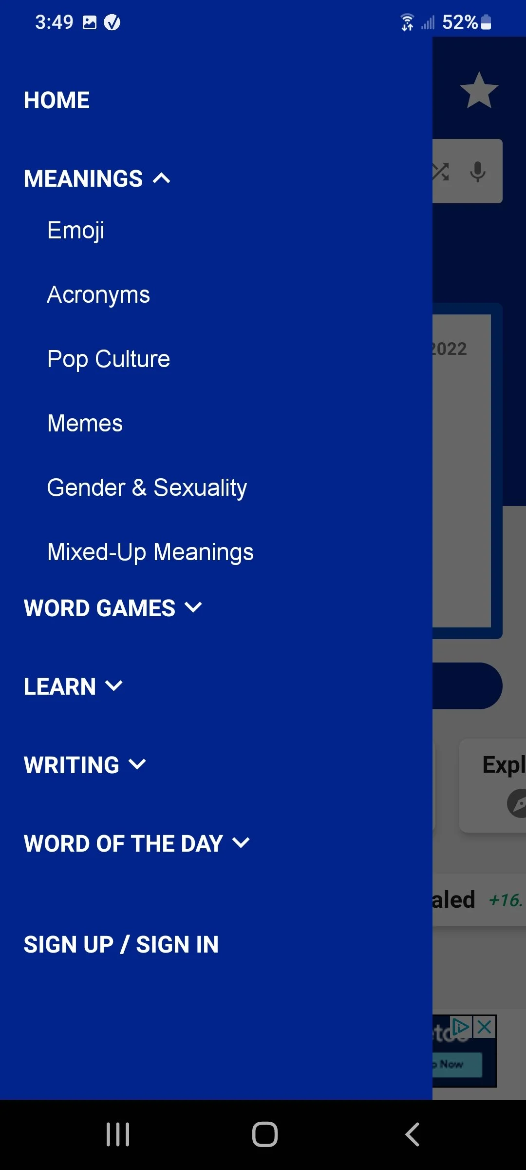
The dictionary app uses a sandwich menu for its main navigation, and is not inviting for the rest of the features of the app. Additionally, the categories are convoluted, and I believe it hides alot of features the app has.
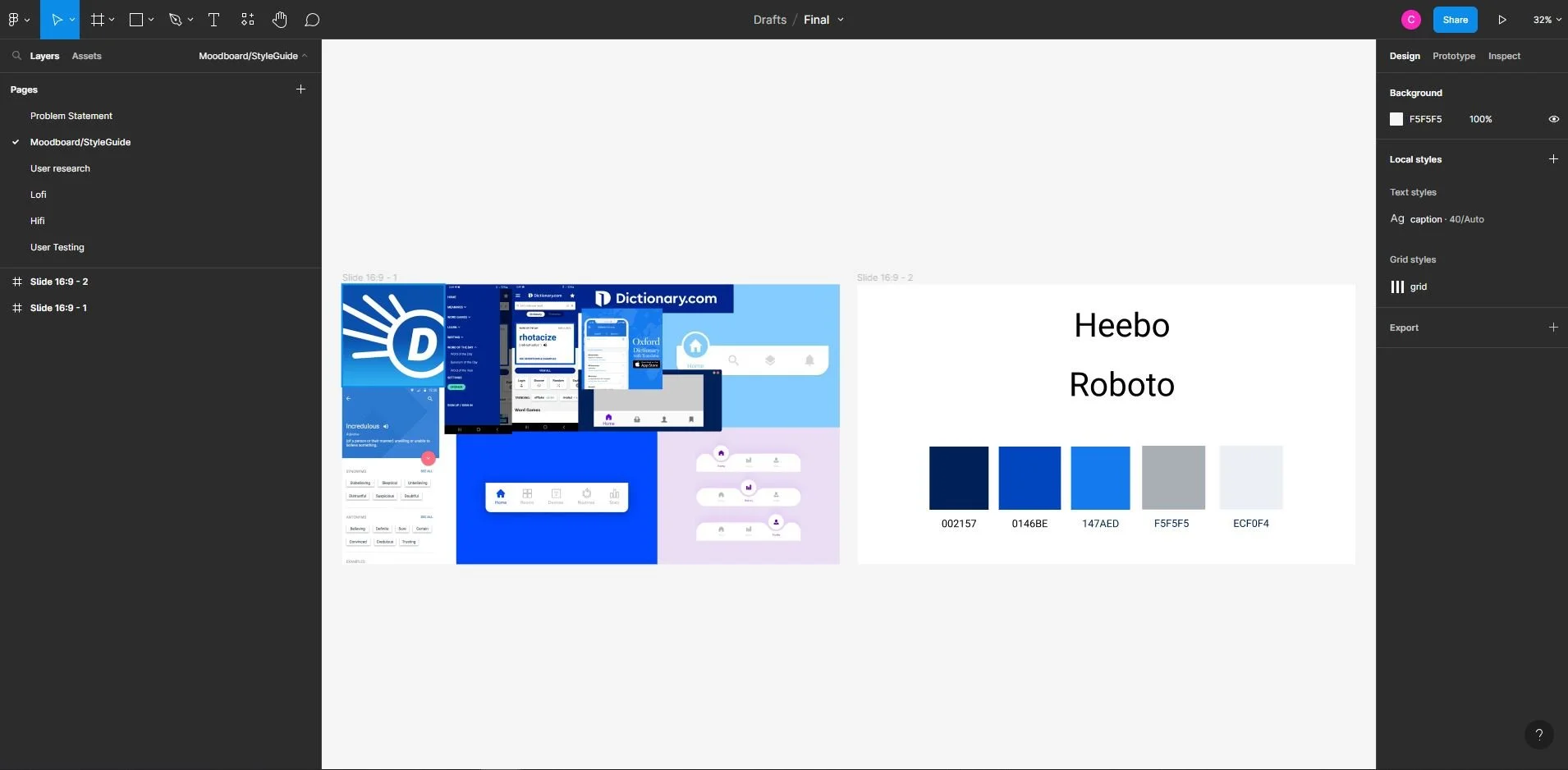
The next step: A Mood board to get the ideas and style flowing
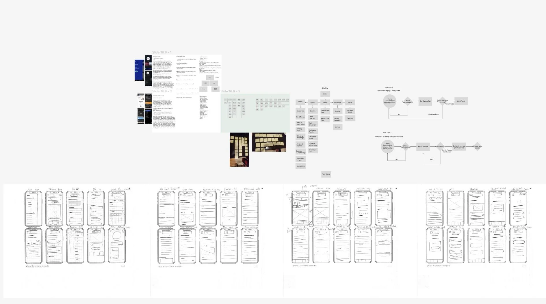
Next it gets a lot more technical. This is arguably one of the most important parts of the UI/UX design process: Research. Whats a good app if it cant satisfy its users?
This began with a card assortment exercise in which I asked several people to organize the menu options into categories that intuitively made sense to them. Using this I was able to determine which pages should belong where.
Then I also did a competitive analysis of the dictionary.com app and its two closest competitors. This helped me see what commonalities they had, and maybe discover new features that I hadn’t thought of.
User flow testing is a common practice, to follow a users journey through a user experience on the app.
Finally, the sketches on the bottom are examples of wireframing. This is similar to thumbnailing in graphic design where a designer sketches out rough ideas of where things might be aligned, and major composition elements.
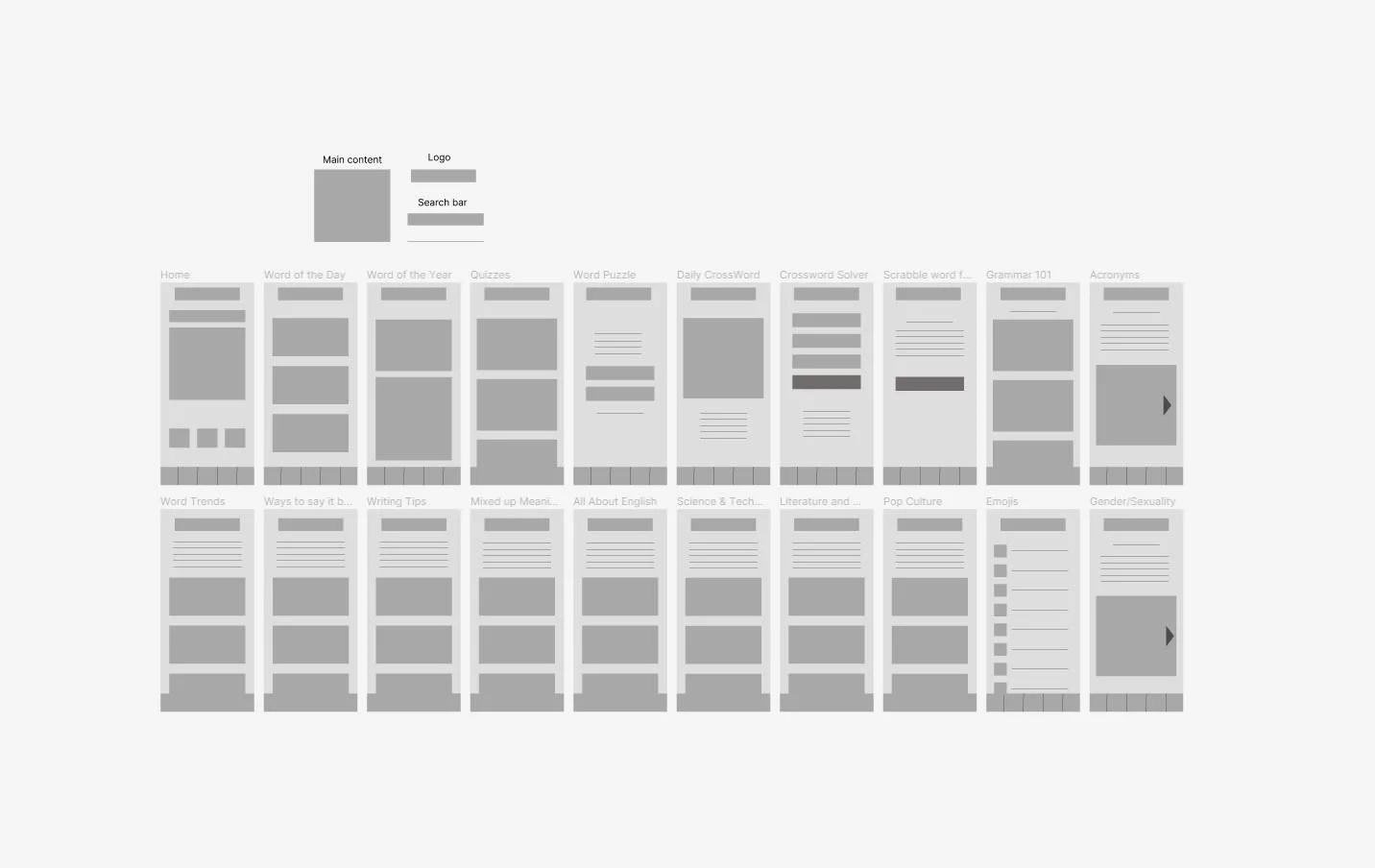
Low Fidelity compisiton of the pages - This allows designer to get a basic layout
High Fidelity
Test the app here:


